7 Websites with Great UX Design & UI Aesthetics

User experience (UX) design is a term originally coined back in 2008 by a chap called Don Norman and describes a design process that user-centred at the core. Every design choice, every interaction and action taken is subject to one critical UX design question;
What value does this add for the user?
You see, UI design has evolved from what it used to be back in the 1990s. UI design must be done with purpose and not just to look pretty. There was a time when HTML capabilities were limited. Technology has evolved, and so has its capabilities on the internet. With that has come with it a rise in expectations from customers and the standard they expect from a digital product, application or website user experience.
UI Design is a feeling
The experience a customer feels when they interact with your business should feel seamless and leave no questions in their head about the actions they take or, what steps are next. Customers should just instinctively know what to click and where to go next.
Let’s take a look at five websites that have beautiful user interface aesthetics or an amazing UX.
1. Nike
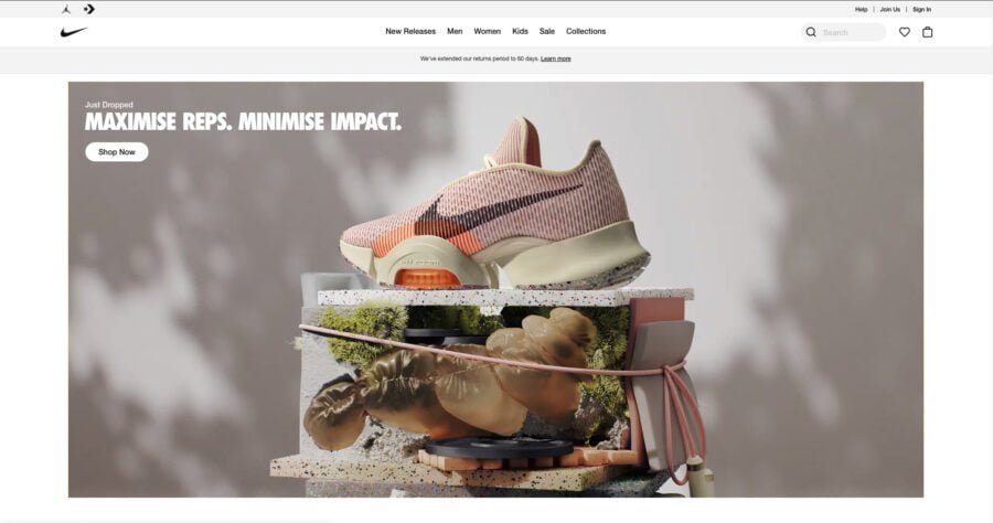
I can talk to a lot of web interface designers when I say that Nike is a brand we all look up to. They always have a clean aesthetic that is easy on the eye and intuitive to the user. Their user-focused, problem-solving approach to eCommerce enables users to find what they are looking for fast.
Clean navigation and site search is the star of the show on the Nike website.
Things I love about Nike
- Loads instantly
- UX friendly navigation
- Clean, Minimal and Focused
- Smooth image transitions upon lazy load
2. InvisionApp: Inside Design
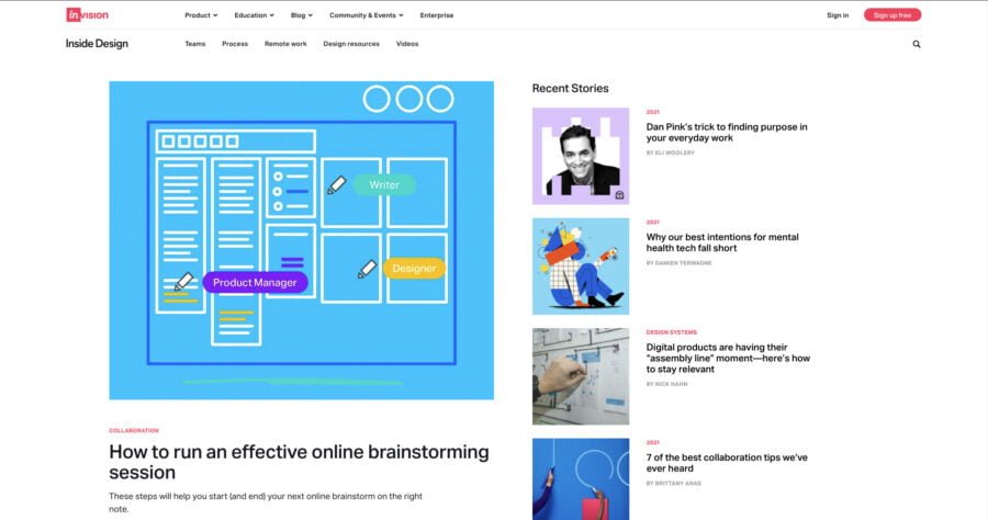
InvisionApp: Inside Design blog has a great initial impact. Everything a user needs is above the fold and accessible without the user having the scroll.
The amazing use of white space, fixed scrolling elements, minimal use of colour and image centred design make this one of my favourite blog designs right now.
Things I love about Inside Design
- Good use of space in browser
- Small UI interactions Add Depth to the experience
- Sub navigation
3. SEJ
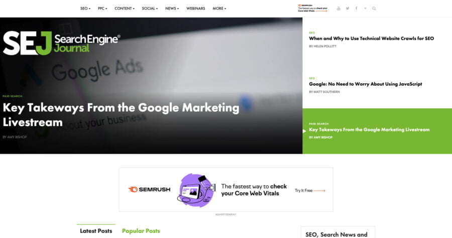
SEJ is a marketing and search engine optimisation blog that has been around for years. I have mentioned these guys because I love the balance they struck between advertising and engaging, quality content.
You often see websites that cram ad units above the fold (yes, I am looking at you), and the truth is, it provides a terrible website UX for customers. SEJ found a great balance between bespoke design, SEO, user experience and advertising which, in itself, deserves a shoutout because it’s not easy to do.
My only issue with SEJ is they neglected any screen size bigger than 1080p. This leads to stretched images and typography issues.
Things I love about SEJ
- Well optimised navigation
- Good balance of adverts to content
- Pop-up does not impact UX
4. Mayerr
Mayer picked up site of the day on awwwards.com for mobile excellence, and it’s obvious why. Great thought and detail went into the aesthetics of the website, which lead to an outstanding out mobile UX and typography that is impactful and clearly conveys the brand message.
The small interaction design touches that went into the site are a great touch. Not too much, but enough feedback that it almost make scrolling feel alive.
Things I love about Mayerr
- Killer mobile experience
- Conveys motion through interaction design
- Standout Website Typography
5. Bennet Tea
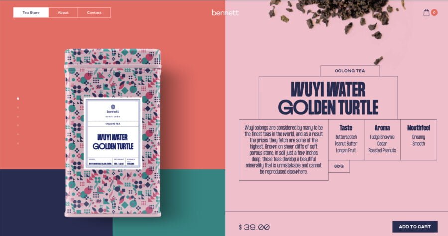
Bennet tea is a typography focused website design that makes great use of flat design patterns. It has a unique layout that initially takes some adjusting. However, the site navigation is clean, and the added page transitions are a nice touch.
Bennet’s website is the perfect blend of style, minimalism, animation and colour.
Things I love about Bennet Tea
- Goes against conventions and works
- Great use of colour and contrast
6. Mendo
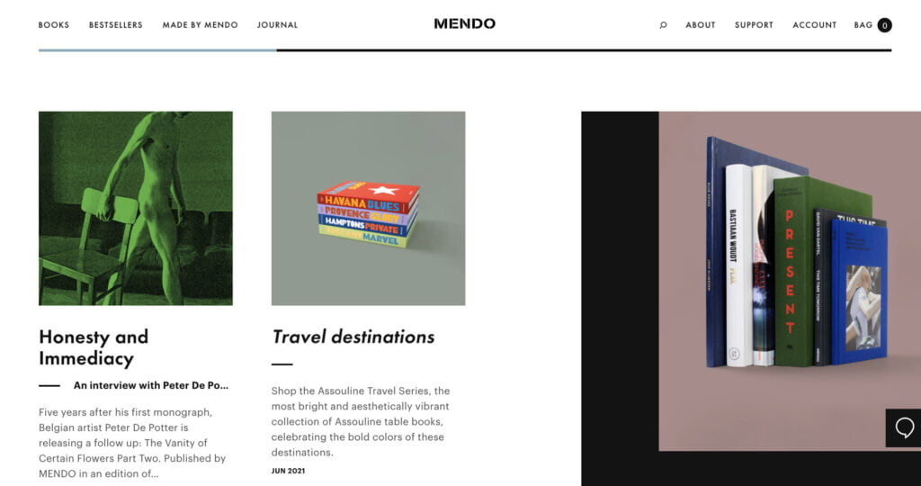
Mendo’s tagline on their website is “aesthetically pleasing books” but as you can see, it’s not the only thing that is aesthetic about this brand. Their website is a treat on the eyes as well as being user friendly and easy to navigate. This surprised me because it is always hard to blend modern UI design with great UX philosophies.
Things I love about Mendo
- Clear, fixed navigation
- Visual scrolling progress indicator
- CSS3 Skew transform on hovers
7. theLAB Berkley
theLAB Berkley takes interaction design to another level with subtle JavaScript-powered animations tied to scroll events and animated videos, stunning UI visuals and a cohesive experience that delivers an impactful UX to the end user.
My only gripe with the user experience of this website is I need to click the menu button to access navigation links. From a design standpoint, it looks stunning but from a UX design view, I think it could be executed a little better by pulling the most important links out of the navigational overlay and inserting them directly into the header.
Things I love about theLAB Berkley
- Sublte movement
- Bright Gradients
- Crystal clear animation
- Amazing use of Google Motion Guidelines